Guardian Redesign
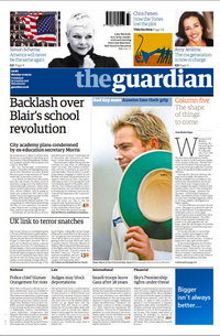
Redesigns seemed to be all the rage today. Between The Guardian paper edition and Gap.com, I don't remember a day of reading more coverage of design. I have very little expertise in the are (of design), but that's never stopped me from discussing things before. With that said, let's get started with The Guardian (or should I write "the guardian"). Anyway, here's a peek at the first edition of their new design, dubbed G2 (and for those interested, here's my commentary on the Gap.com redesign).

Before I even get started talking about this, let me direct you to a real critique over at cityofsound titled "Assessing the new Guardian, with brief nod to the avant-garde (aka Grazia, Heat and The Sun)". The first thing you'll notice is they've moved to tabloid. That's a pretty big deal for a well-established paper like The Guardian, I mean, imagine if The New York Times was the same shape as the New York Post. Would people take it as seriously? It's a great illustration of just what "the medium is the message" means. The layout of the newspaper tended to let you know how "serious" the paper was. That is the case no more. Many of the world's most important papers (including Le Monde) are now tabloid. This move by The Guardian (and others) is mainly about making it easier for people to read the paper. The fact is, broadsheets are a bit outdated, especially in crowded cities. Have you tried to read The Times on a New York City subway? You always end up smacking someone in the face as you try to turn the page. It's just no fun, especially compared to the page-turnability of The Post or the Daily News.
Beyond the switch of format, the most notable change is the new title. The paper has chosen to go with an all lowercase approach. It's kind of interesting to see a paper do this, as those capitals and elegant fonts seem so attached to the newspaper world (at least in America). Again, imagine if you saw "the new york times" across the top of your Sunday paper. How would you react? Throw in a little color behind the title and it's hard to tell you're even looking at a newspaper anymore. In fact, the whole thing looks a lot more like a cross between a magazine and a website than it does a "newspaper." I mean the cover has little arrow icons pointing you to the page where the article continues, ala a web link, and a photo/caption montage across the top, ala magazines.
All in all I like the way it looks. If you'd like to take a closer look, here's a PDF of the front page. Also, as I mentioned, for a much better analysis, visit cityofsound.